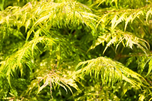
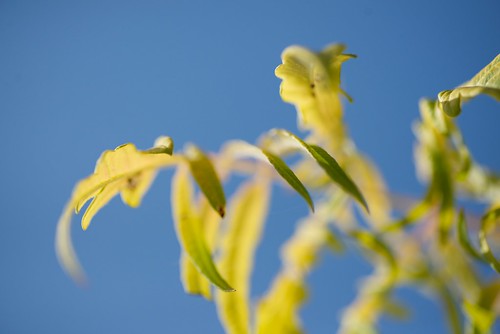
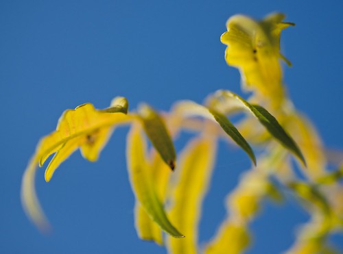
Yesterday’s foray to Coastal Maine Botanical Gardens was timed to coincide with the Eclipse (not much more than 50% in Maine), with the idea that colors might be affected by the altered light. That wasn’t particularly noticeable, but I got engaged with looking for novel forms in the vegetation, and found myself using f4.5 and a macro lens for almost everything I photographed in color (I also did a bunch of infrared, but that’s another story). The shallow depth of field produced a lot of interesting results, and nudged me into thinking differently about post-processing. In these three examples I’ll try to summarize what I did and why, mainly to remind myself of my thought process and sequence of decisions. Each of the images could be handled quite differently, and I may try other approaches once I’ve lived with these for a while.
I feel pretty insecure about color, and in general prefer monochrome. That’s partly a matter of age: I began in the days of black-and-white (early 1960s), wasn’t attracted by the anemic color in prints of the time, did a lot of didactic slides in Kodachrome and Ektachrome in 70s and 80s, and only got my hands on manipulable color with the advent of digital imaging. I greatly admire Betsy’s use of color and emergent mastery of color printing, and I’ve enjoyed tessellation experiments that are deeply reliant on color, but I’m still more at home in monochrome. Not that I “see” in black and white—indeed, that has been an elusive goal from the beginning, and I don’t seem to make much progress.
The three examples were processed in Aperture. I’m part way through the conversion to Lightroom, but still find it easier to do quick manipulations in Aperture. And ‘quick’ is what I seem to prefer: I want to see the results sooner, and perhaps return to successful images for more extensive processing later. So I nudge sliders and try black and white filters and generally mess around until I see something that looks more or less optimal. It’s pretty seat-of-pants and tentative, scarcely to be dignified with the label ‘workflow’.
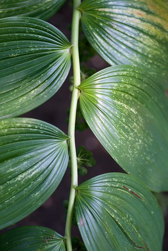
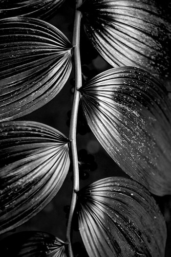
The first image just seems an obvious candidate for conversion to monochrome, and it’s a stronger photograph once the green is stripped out. Obvious and derivative, little that’s original in viewpoint or handling, but satisfying as an encounter with the unique genius of this particular plant species:
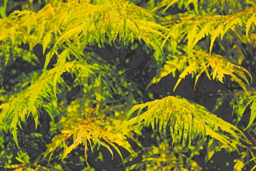
The second image seems to me much better framed with a substantial crop (should have seen that in the viewfinder, didn’t). Contrast, Black Point, Definition, Highlights, Shadows nudged to enhance drama. I’m tempted to see it as a rooster in mid-crow. But what, I wondered, would happen if it migrated to monochrome? The Red Filter darkens the blue most gratifyingly, and a bit more tweaking (Definition,Mid Contrast, Black Point) brings it to a satisfactory graphic conclusion.
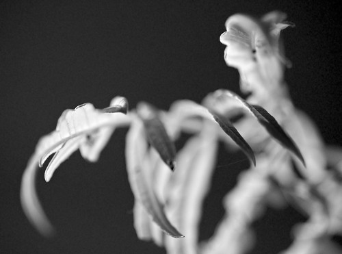
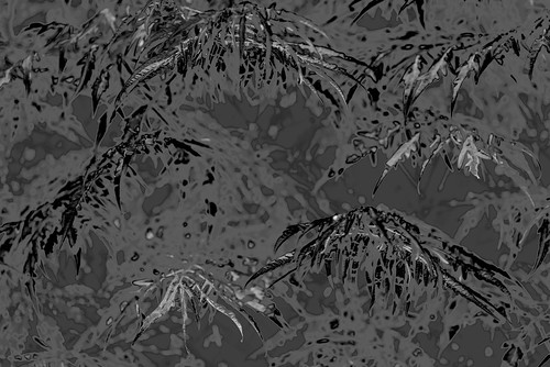
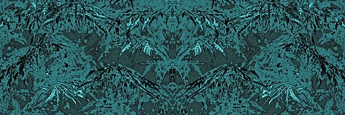
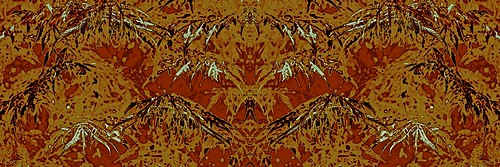
The third image is another sort of challenge/opportunity. The original photo doesn’t amount to much, with blown-out highlights and nothing very convincing in the forms/shapes, but some fiddling with parameters (down Mid Contrast, up Contrast, up Black Point, up Definition) makes it more interesting. Something worthwhile is beginning to emerge from the shadows, a sort of background abstraction. Not bad. But take away the color and apply the Blue Filter (and up the Shadows, the Definition, and the Contrast) and suddenly we’re in new territory. Ready for tessellation, headed in the direction of a fabric design. Maybe a reason to explore split-toning.