The following shows me wrestling with a fairly simple problem in making data tell stories. I knew there was a relatively easy solution with the tools available (Excel), but was sufficiently ham-handed with the application to need instructions in step-by-step form. So I did a google.com search for 'excel age pyramid' and found a number of sets of instructions for this elementary procedure. None worked straight out of the box, and in fact I've had to adapt them [and should write a better set myself...], but I've got a semi-successful result. More than a bit of a talking dog, of course.
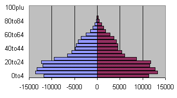
After a protracted struggle, I have an age pyramid for Shenzhen, one of Guangdong's Special Economic Zones, illustrating the county's drawing power for (especially) young females:
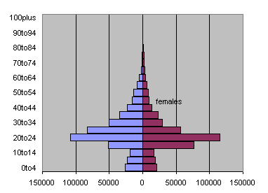
And here's the adjacent county of Dongguan, showing a similar pattern: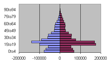
And here's the pyramid for Bobai, one of the counties with a high M/F ratio, suggestive of a systematic and long-running 'strategy' of female infanticide (the pagoda-like morphology is characteristic of "Third World" age pyramids, with high birth rates and a large proportion under 15 years):
(of course, what I'd like is to have the graphs uniform and thus directly comparable... a bit beyond my powers at the moment)... (AND I'd like a way to automate the extraction of the requisite data from the .dbf files, so that there's less data massage necessary)
Late-breaking news: I figured out that I could use <control><c> to select cells from the table (M 0-4, M 5-9, ... M 60-64...), then use PASTE SPECIAL and TRANSPOSE to paste that set into the spreadsheet... so making the dataset is less problematic than I had thought.
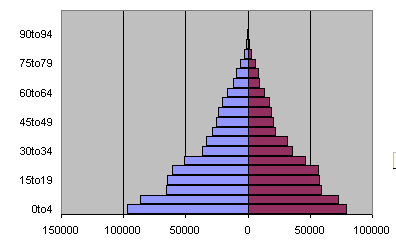
...and so it took much less time to make the pyramid for Quanzhou Xian (the most northerly county), which shows a high M/F ratio but also a decline in the size of the youngest cohort, suggesting overall fertility reduction: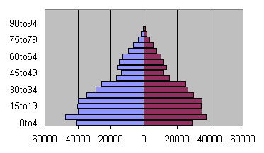
Clearly what I'd like to have is the full set of pyramids for all counties, but it would be tedious to make them in this hand-assembled way. There might be Excel macros that would speed up the process, but I haven't the time to learn them at the moment.
And finally, after some more Excel manipulations to gather all male cohorts onto one sheet and all female onto another, here's the pyramid for Guangzhou Shi Shixiaqu (Canton City), showing a common 'urban' pattern, with less suggestion of female infanticide as 'strategy' and considerable evidence for inmigration of young adults: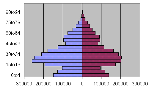
One more: something else seems to be going on in westernmost Guangxi, so I constructed the pyramid for Tianlin county, which seems to show a balanced M/F ratio in all age cohorts, suggesting no attempt to exercise a preference for males: