With ArcView we have the tools to make and distribute maps and analyze geographical information. The process of distributing these capabilities to faculty, staff, and students is just beginning, and what follows below is a narrative of a part of that process. I'm putting it together to record my own progress (and as such it will evolve as my own skills do), and to provide some basic instructions for coping with a very complex and powerful technology.
On 9 November I downloaded many megabytes of zipped data from the 1990 census of China (located at http://sedac.ciesin.org/china/ and described in detail at http://citas.csde.washington.edu/data/chinaA/datasets.htm). I had previously downloaded outline maps of China's provinces and counties from CESIN. The whole dataset can be thought of as a matrix consisting of data for more than 2000 counties and more than 400 variables. ArcView allows us to turn these data into pictures (well, maps), and encourages us to ask questions of the data: why is this or that variable distributed in this manner? how does one variable interact with another?
ArcView is relatively easy to learn the basics of, so that maps can be displayed and printed out (or put on the Web) without too much hair-tearing, but there are some conventions and tricks that have to learned. The more advanced features of ArcView are a greater challenge...
Data can be found bobbing around in the Web --CIESIN is one example of a pretty comprehensive source, but there are others. We have a lot of US data on CD-ROM as well, and it's entirely possible to build maps and datasets from scratch, or append data to existing datasets.
It's often necessary to manipulate data before mapping them, and spreadsheet programs are the tool of choice for this purpose. Excel is the one I generally use, usually to produce data files in .dbf format, which can then be read by ArcView. Here's a step-by-step description of the process of (1) preparing a new variable by manipulating two census variables (in this case, dividing number of immigrants 1985-1990 by total population to yield a percentage of immigrants) and (2) JOINing the resulting information with ArcView counties data to produce a map, and then (3) using PhotoShop to create a .jpg image for display on the Web. It took me a while to stumble through this process the first time, which is why I'm writing it out in such excruciating detail. Manuals are most helpful when you already have a clue, but are pretty impenetrable if you're just beginning.
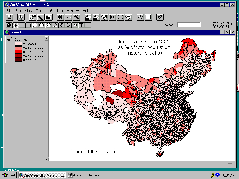
(1) Using Excel to create the new variableHere's an example of the result (not very elegantly done):Open the .dbf file containing data for total population and total immigrants (and also including the ID number for each county). Make a new column, entering a formula into the first data cell to divide total immigrants (in column AA, say) by total population (in column D).2. Using ArcView=AA2/D2Click on the cell containing the numerical value, and then click and drag the box in the lower right corner of that cell all the way to the bottom of that column. This will perform the same calculation on all cells in the table.
(divide the value in cell AA2 by the value in cell D2)
Hit ENTER to see the result of the calculationUse <CTRL>Click to select two columns from this table: the new variable (the calculated percentages) and the county ID number. Choose COPY from the Edit menu to place these columns into the Clipboard.
Then open a new spreadsheet (<CTRL><N> will do it) and PASTE the two columns (<CTRL><V> will do it). Select the column containing the percentages, and click on FORMAT in the menu bar. Select Cells..., and choose Number (instead of the default General) as the format for the contents of those cells. Then Save the new spreadsheet as DBF IV (.dbf), and not as an Excel workbook.
Now you're going to JOIN the new .dbf file to an existing file which shares a common feature (the county ID number) with an ArcView table, so the ORDER of things matters a lot. Here's the procedure:3. Grabbing the displayed image and converting to .jpg for web displayStart ArcView. From the Project menu, choose Add Table... and locate the .dbf file to be attached, double-click its icon, and click on the column to be used as an index (the county ID number).Click on the Project window ("Untitled"), then on the New button, then on the "Add theme" (+) button. Choose the desired theme (in this case it's Counties) and feature (e.g., the polygon option --the outines of the counties).
Double-click on the the colored rectangle to change its symbol, choose the outline instead of a solid color.Click on the "Open theme table" button, locate the index field and select that column. You'll notice that the JOIN button will light. Click the JOIN button and the .dbf file will be added and indexed. Close the Attributes table.Open the Legend editor (double-click on the rectangle in View 1), change Legend type to Graduated color. Then use Classification field to choose the variable for display (the % immigrants, in this example). This will display the values by the default clasification method ['natural breaks'], but you can use the Classify... button to change the method and/or the number of classes displayed.
Use the Apply button to display the result.
The Print Screen key will move the screen image to the Clipboard. Open PhotoShop and use PASTE to put the image onto a new page; use the frame tool to select the part of the screen image you wish to save, COPY the selected image to the clipboard, open a new PhotoShop image and PASTE the contents of the clipboard into it.Then, from the Layer menu, choose Flatten image. Then save the result as a .jpg, which can then be linked on a web page with the <IMG SRC=...> tag.
12 Nov
I've used the ESRI Digital Chart of the World (which we have on CD-ROM) to create
a couple of maps of the Yangtze Gorges area (Yi-Chang being the city near the site
of the new dam). The resulting .jpg images are pretty enormous (300K+), but
not without charm. The first shows watercourses, and the second adds land over 3000 feet.
The DCW is hard to find one's way around in, but this guide from Penn State is about as good an introduction as I've been able to find.