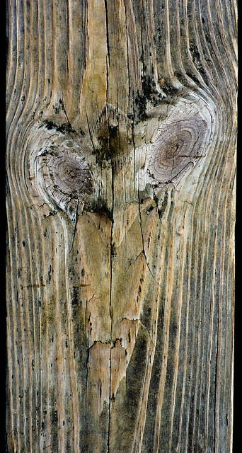
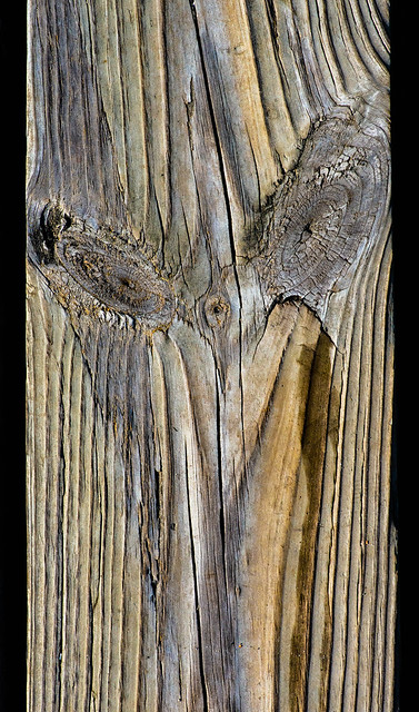
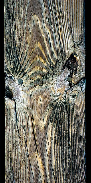
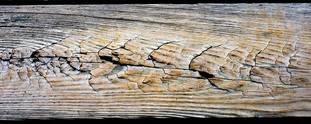
Lumber Portraits
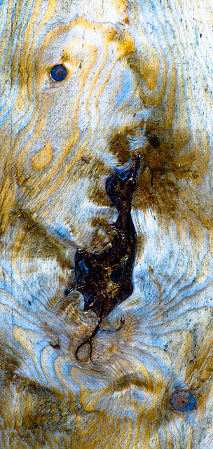
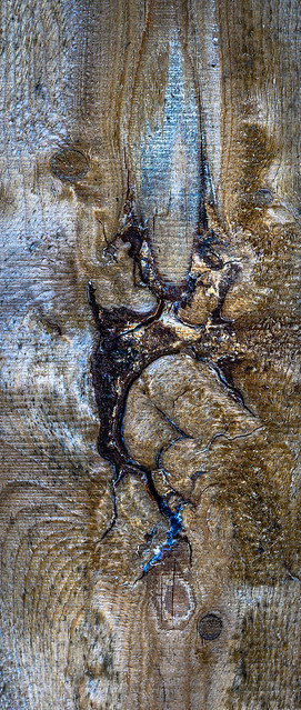
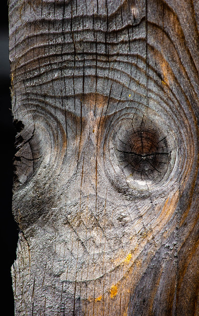
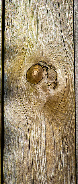
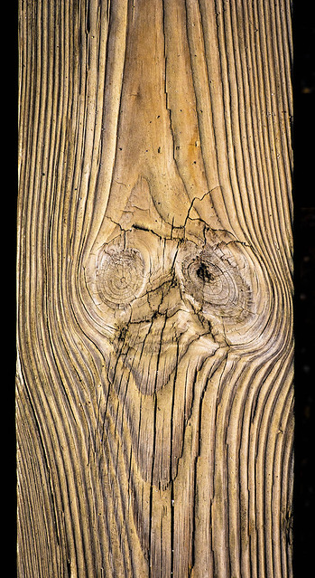
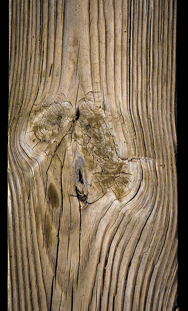
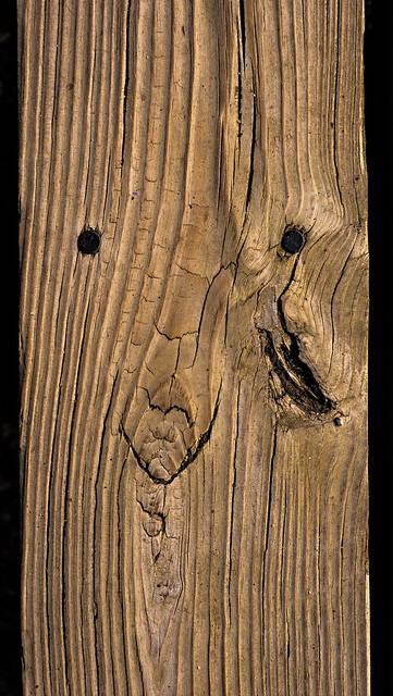
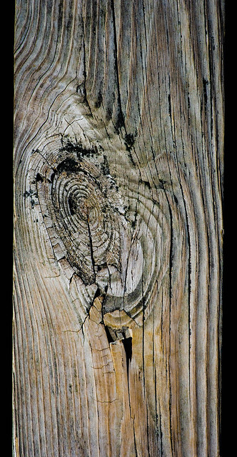
Most of my work with wood has been in monochrome, but a bit of experimentation with augmentation of the color in a recent image (the first, below) got me thinking about trying to bring out the chroma that lives within other images that I'm used to seeing as black and white. This collection is intended to help me think about new approaches to presentation—the old "how can I know what I think until I say what I see..." (or "see what I say" in the original formulation). Do new and useful things emerge from familiar images as color is reintroduced (by reprocessing of the original RAW files) and tweaked with Lightroom's Vibrancy and Saturation? What works, what is garish or otherwise rings false?
=====